There’s so much to say about UX and theme parks, and I’m sure there will be more posts about it. It really is a designers dream, nothing is accidental and there’s always something new to study and dissect.
So why attempt to draw a parallel between two seemingly different industries? Well I don’t think they’re that different at all. At the most basic level they’re both dealing with the flow of people, and trying to direct each individual at the most optimum path to get where they want to go.
If you think a little deeper, there’s an aspect of user control. In a theme park, if wait imes rise, and crowds form bottlenecks, what is the goal? to push people towards the emptier areas of the park – easing congestion and incresing user experience. In the same way, when a website has congestion to deal with, it manifests as increased load times and users have to wait. These are similar issues that have to be dealt with in similar ways.
Theme parks, like websites are full of little moments which make a designer think. It’s a unique environment for a designer as everything you look at has been designed and placed by someone for a reason. None of it, obviously, is anything near natural, it’s all there by design, but it’s not always obvious how clever it all is.
I’m going to walk through a couple of my favourite ways theme park UX is enhanced, some maybe obvious some not so much but all of them enhance the user experience to the point that it wouldn’t be the same if they weren’t used.
Disney’s D23 2024 has just concluded, and there was a whole host of new park news, including substantial expansions, including multiple new rides and lands to Disney’s Magic Kindom and Hollywood Studios which got fans talking about where these new developments will go.
It’s a good question, no details were given at the time, though we know a little more now, social media was full of speculation, and people filling in the green space they saw on the park maps given to guests.
The problem with this is that the green space you see on the official park maps for a Disney Park, isn’t necessarily vacant space.
Using a map to navigate the park is essential, and Disney needs to keep this as uncluttered as experience as possible and keep the immersion level as high as possible. This means that any buildings that are not not guest facing isn’t included on this map.
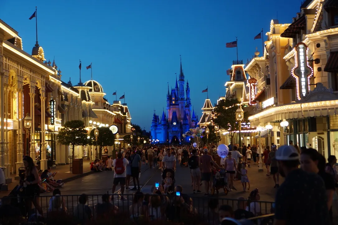
Disney theme parks employ something called ‘forced persepective’ to enhance guest experience. This is all about making buildings seem higher than they really are. The best way to explain this is using the Magic Kingdom Main Street as an example.

The first two stories of many buildings are built to real-life dimensions, then, each floor above the second are built to half scale. From the ground this gives the appearance of a regular, but taller building than it really is, becasue the smaller scale of the upper floor makes the guest feel they are further away from it.
What you see isn’t usually what you get when it comes to buildings. You might see a Haunted Mansion – for instance, but you really see a facade, a prop frontage, behind which lurks some sort of warehouse housing the ride, and ride infrastructure. It’s kept from the eye of the public to maintain the illusion. but it ties in with all the ‘phantom’ green space on the park maps – this is where the ugly boxy buildings are hiding!
The way many theme parks are designed and the thought and effort that’s put into the guest experience is a treasure trove for a designer to dive into and find exciting and relevant things to talk about – and things to inspire.
