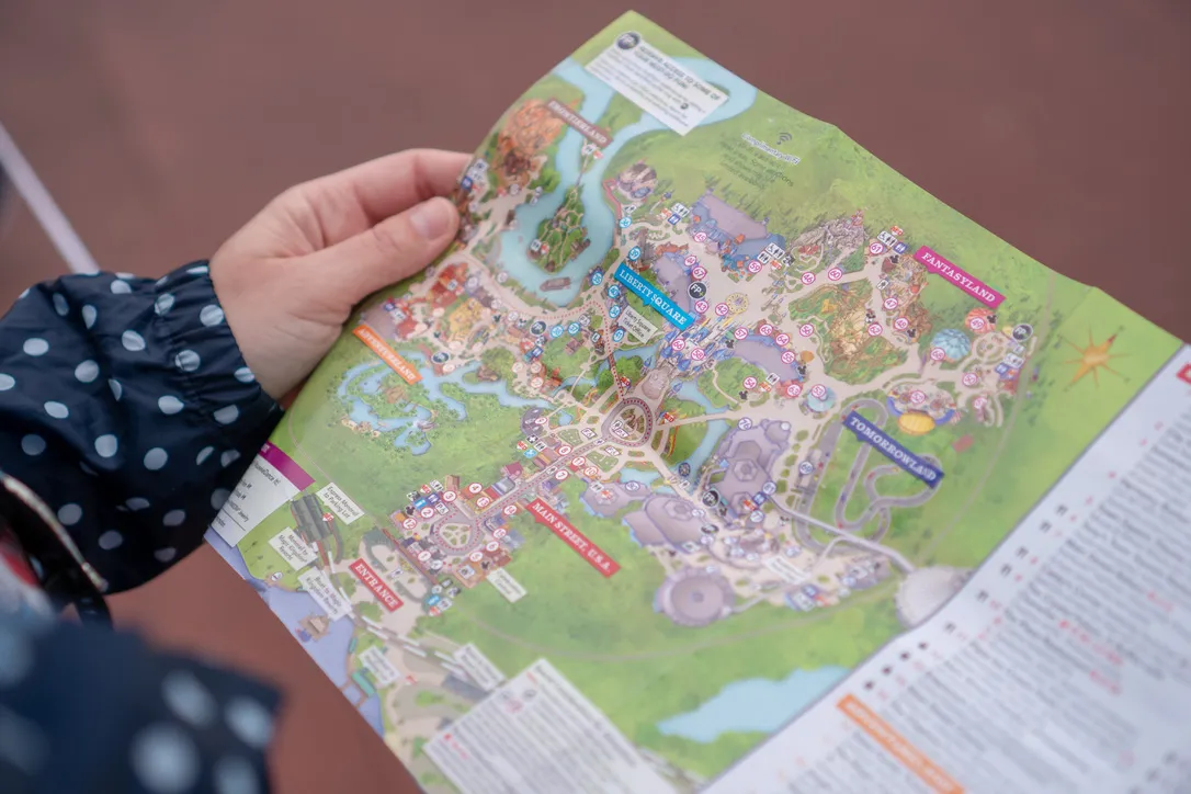
One way designers of large destinations, such as my favourite comparison point – theme parks – can keep guests aware of their location is by using focal points.
These are large structures that can be seen from almost anywhere in the park – The Magic Kingdom uses the castle, Animal Kingdom has the Tree of Life and EPCOT has Spaceship Earth.
These orientate guests, and provide a reference point for navigation in relation to the park entrance, or their next destination. These focal points offer a way to orientate a guest with little effort on the part of the guest themselves.
Web Design has a similar paradigm. For example, the Header and Footer which are usually static act in a similar way to a focal point. By providing a continuous and familiar presence at the top of a page, the Header is something which helps guide the user back to the landing page (or any other page) of the website with little effort. The user doesn’t even have to know how to get there, they just click home and there they are.
These fixed points are important to keep users spatially aware of their location, whether that be in a physical or a digital space. This can help to reduce disorientation, and a disoriented user is likely to experience increased levels of frustration and unhappiness with the experience – which is not what we’re going for!
Allowing users to jump back to familiar points in an experience is often a standard part of web design in 2024, but it’s important to flag up why this is a worthwile feature of your website.
