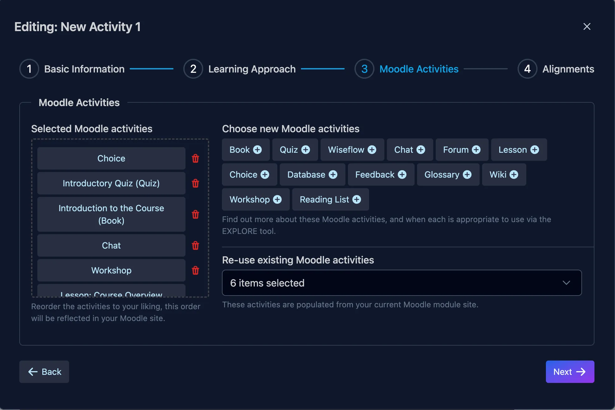
This control is part of a series of screens within a ‘Stepper’ element which allows a user to set up a eLearning module via a series of pre-controlled options compatible with the eLearning parameters of the institution within which I work.
When the user is done on one screen they are encouraged to click the highlighted Next button to continue. Though they are also given a control to take them Back to previous page if they so choose.
The Problem
The project i’m working on requires the user to select from a series of primary options, that have a few criteria:
- They may select each option more than once
- Selected options are required to be highlighted to the user before they begin (as preferred options)
- They all need to be identifiable
- The list of selected options that the user creates must be able to be reordered
- There is a secondary list of items, which may or may not exist, and also needs to be able to be added to the same list as the first set
Exploration
Initially I had used a simple multi-select dropdown, but this wouldn’t acheieve the aim of allowing repeated selections. My revised approached contained three main elements:
- A field to display user selections
- A list of options as buttons which allow multiple selections of the same item
- A dropdown multi-select list of the secondary existing items which are only allowed to be added a single time.
The Solution
This exploration has been created in Vue.js and this project has a mix of pre-created accessible components from Prime Vue (very much recommended) and some custom elements created by myself - which I hope to go into in detail in another post.
What you need to know here is that I have built some form elements which I can add help text to if I choose, which is very helpful with more complex interactions. You can see this in the header image above.
The user first sees the selection area where their selections will appear. I wasn’t confident if this should be positioned before or after the selection options, but I decided that this was the most important element and should be seen first. User testing will confirm (or not) this idea.
The primary options are laid out in a grid to the right of the selection area. All options are visible and this was possible the amount of options are known ahead of time, and won’t change.
Beneath this there is a multi select dropdown which shows an unknown number of choices which are only selectable a single time each. They can be toggled on or off via this list. The list is also searchable for convenience.
